Project Goals - Why make a Remix?
Brian and I had certain goals in mind when we decided to work together on a project:
- Minimize design risk.
- Improve our non-design development skills (art for me, code for Brian).
- Become familiar with other parts of indie development (marketing, business, etc).
The first goal in particular was quite tricky given that Brian and I are skilled designers with a strong urge to make new and novel things. So to mitigate that risk, I suggested we license the design from an existing game: the Captain Forever series created by indie developer Farbs. I worked with Farbs while we were both at 2K Australia, and so licensing the Captain Forever design from him was not difficult as there was already a lot of inbuilt trust between us. It also helped that I was a legitimate fan of the original series.
Art and Creative Process: Building a new World
This poster was one of the first major art assets I created for the project.

This image had to carry out many duties:
- Introduce and launch the game to the world and get people excited about it.
- Convey the tone and aesthetic of the project.
- Exhibit our core creative themes: creativity and imagination, childhood nostalgia, 1990's time period, Saturday Morning Cartoons, high adventure, and the core gameplay theme of building spaceships.
- Tell people that this was going to be more than a gameplay remix of the original Captain Forever: that we were creating a new world.
The crazy thing is that when I started working on this image (and even once it was done):
- The process of defining the art direction had barely begun.
- The themes we'd explore in the game were very roughly defined.
- We hadn't designed a world, narrative, or characters. I didn't know who the main character was, or the big pink half-face at the top of the poster, or those weird-looking animals.
So the poster was basically a bluff: we released it to the public and it looked like we knew far more about the project than we actually did. We didn't know who the character Captain Forever would be (and once this image was done, we still barely knew, other than "it'll be a young kid"). We knew we wanted a visually-striking and iconic villain, but not much more than that. Hence, there's a giant pink face with very iconic features (a band-aid nose, and an eyepatch with a star-strike scar running through it) at the top of the image. But we didn't know who this character was, and I didn't know what the rest of his or her face looked like.
Even given that, creating this image so early in the project proved to be incredibly useful. It proposed questions and forced as to start answering them. Some of them were answered by making this image, such as gaining a much better idea of what the game would look like. Others would be left alone for a while, and later reverse-engineered from this image.
Here are some WIP images of the poster:


World Building
In the process of making the poster I explored a lot of ideas for what the world, narrative and characters would be.

One early idea was that the entire game would take place among the space-born wreckage of a destroyed earth. We moved away from this idea because we felt like post-apocalyptic settings and themes were already well-trodden. The then-recently-announced Habitat was already exploring the idea, so we ditched it.
I wrote an insanely massive "world bible" document that formed the basis of the final story in the game and defined the world's history. The core idea that the game is taking place entirely in the imaginations of sibblings Natalie and Kevin (aka Captain Forever and King Kevin) was present in this document, though we originally aimed to have it be left to the player to decide whether what they were seeing was real or not. Eventually we decided to remove the vagueness and make it clear to the player that they were taking part in a game of make-believe.
During work on this document I made various diagrams to help me explore the history of the world.

Writing this document was a very useful part of the creative process and forced important questions to be posed and answered. Who are our main characters? Why are there mutant space animals? Why are King Kevin and Captain Forever fighting? What happened to the solar system? What time period is the game set in? Etc.
Here's a small excerpt outlining the intent of the exercise:

This process and the world bible document allowed us to come up with new ideas for how to present the world and narrative in-game. The twin images below are used to solidify Natalie and Kevin as Saturday Morning Cartoon junkies, with "Captain Forever Remix" being their favorite TV show. Elements from their real-world are brought into the imaginary world of the game, such as their pet cat (who appears as a Krusader) and Natalie's bike helmet.
The morning-time image is shown on our in-game main menu, and the night-time scene is shown when you beat the game. It depicts Natalie and Kevin having finally fallen asleep after a day of watching Captain Forever Remix, eating sugary treats, and playing make-believe together.


Defining the Tone and Aesthetic

I made a bunch of Pinterest boards and saved hundreds of images that would serve as inspiration. Photos of animals, scenes from 90's Saturday morning cartoons. Motorbike gear to inspire Captain Forever's costume and helmet. Toys that scream "the 90's". Glow-in-the-dark *everything*. All of this helped us hone-in on a specific aesthetic and tone for the game.
A drew a lot of inspiration from the 1990's "Golden Age" of Saturday Morning Cartoons. Nickelodeon was doing it's best work, and parents didn't know any better than to let us watch Ren & Stimpy. I wrote a blog post about these influences.
NATALIE NORBERRY AKA CAPTAIN FOREVER (SHE CALLS DIBS ON BEING THE HERO)

Above: the final design for Natalie Norberry AKA Captain Forever
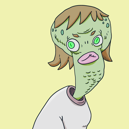
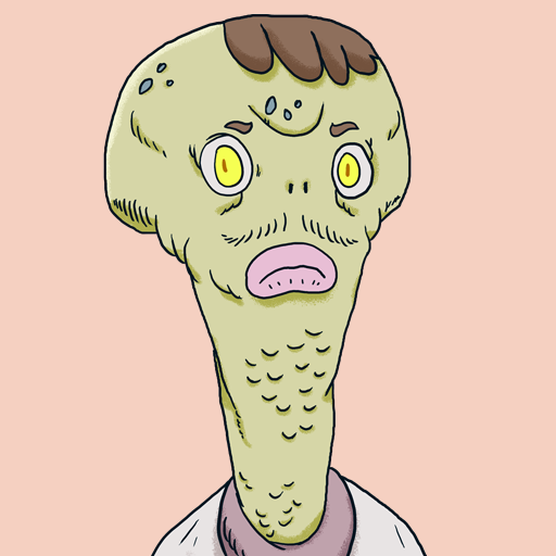
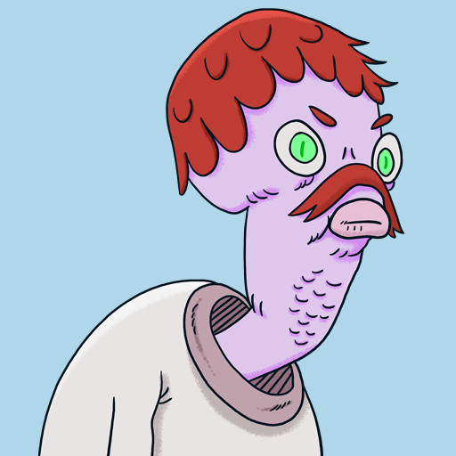
Natalie was one of the final characters to be designed. For the longest time I was really unsure about how to approach her character design, and nail down details about her character. Things like her age, temperament, etc. Earlier concepts explored different approaches but ultimately didn't work out (though they did help me zero-in on a final design). For example in this abandoned concept Natalie felt too old and mature:

I wanted her design to feel iconic, memorable, and recognizable. Her starry glow-in-the-dark helmet was a part of this effort, along with the hole cutouts for her pig-tails. I followed the glowing star design through to her in-game command module craft.

While figuring out Captain Forever's visual design I made this "ToDo" list written in her voice. This helped us explore the character, her background, and motivations.

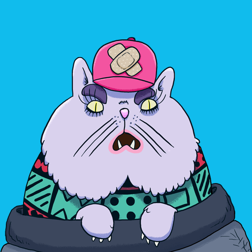
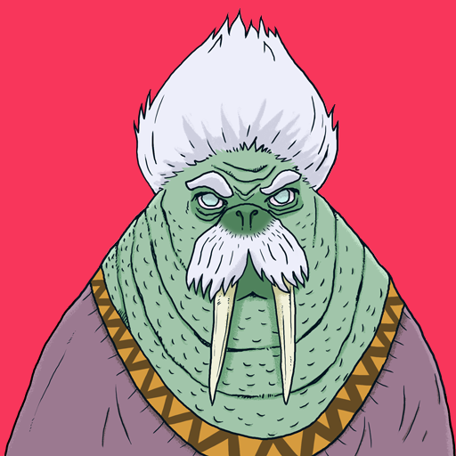
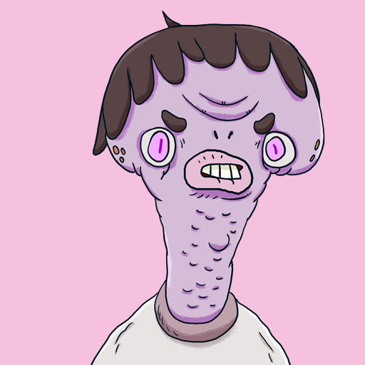
Natalie's brother Kevin AKA KING KEVIN ThE Bubblegum Mutant (he's the Villain)


Above left: the final design for Kevin Norberry
Above right: the final design for King Kevin, his bubblegum mutant altar ego
The design for King Kevin went through many iterations before arriving at a final result. I worked from the strip of a pink face included in our launch poster as a starting point for his full design.
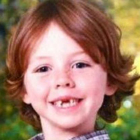
I gathered reference images of young kids. I wanted the design for Kevin (in both human and non-human forms) to visually communicate that he's just a young boy. Gap teeth are a major feature here.

I made pages and pages of sketches. I tend to keep these sketches very small so that I'm forced to make every feature of the design count.


Multiple attempts were then made at a final design. Brian and I would look at these designs together and discuss them. Feedback would be taken through to the next attempt.


Above: We decided the design on the left looked too inhuman, more like a monkey than a human child. The design on the right just didn't gel well with our other characters. The proportions felt wrong, and it felt out of sync with my general style. Plus we thought he looked too gross. We wanted him to be fun to look at!
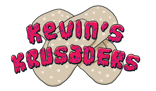
KEVIN'S KRUSADERS
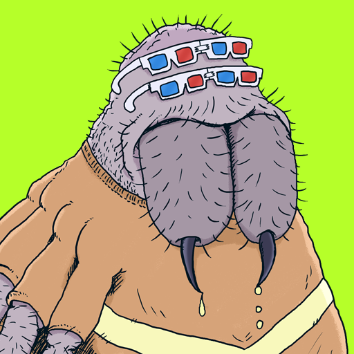
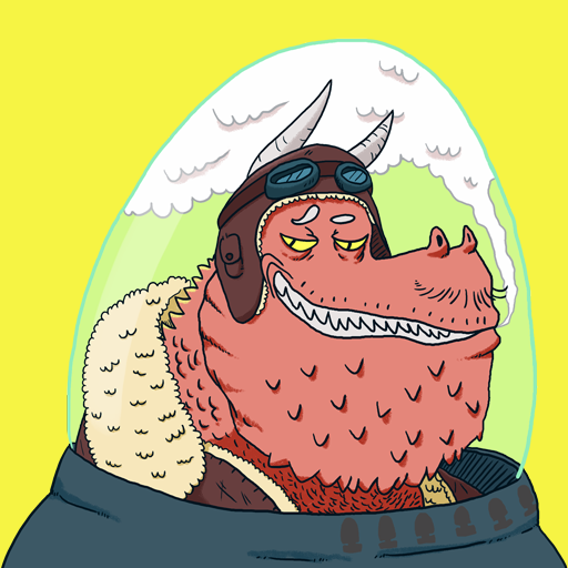
Some of the final designs for Kevin's Krusaders:
It took a lot of exploration to zero-in on the idea that all of King Kevin's flunkies would be mutant animal space pilots. Early exploration went wide. I sketched many ideas, including aliens, sentient inanimate objects and household items, talking flowers, and of course animals.

We settled on the idea that it made sense for Natalie and Kevin's game of make-believe to be filled with their favorite animals. Stuff they'd seen on TV, at the zoo, and their pets.
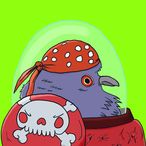
I'd create new concepts for characters by first picking an animal type. I'd then look at photos of that animal, and make multiple pages of sketches. The important part for me was to give each character a personality purely based on it's look, and by adding as many "ideas" to their visual design as I could, such as a pigeon that is also a daring space marine.
Below: Note the "yes!" text pointing to the sketch that I picked to use for the final design.


The Peacemakers
The Peacemakers are a marauding band of aliens who spread peace across the universe...by any means necessary. They appear in the final stage of the game. It was a goal to include aliens somewhere in the game, but not have them be a common enemy. So throwing something new at the player in the final stage felt fitting. They're also a nice reference to the "Peace Keeper" ships from the original Captain Forever.

The Peacemakers are my take on the classic "grey alien" figure. I wanted my version to look somewhat goofy and warmer. The sort of design you'd see on "Aaaaargh! Real Monsters!". I made pages and pages of sketches until the design "clicked".


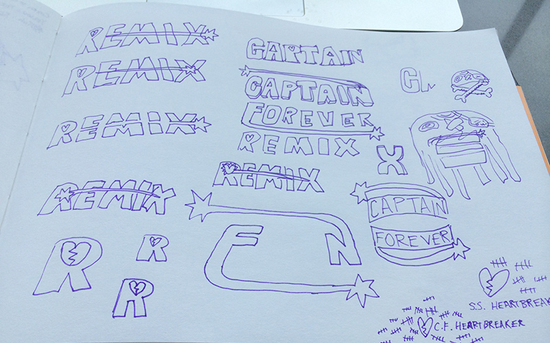
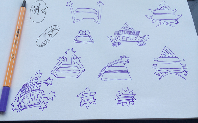
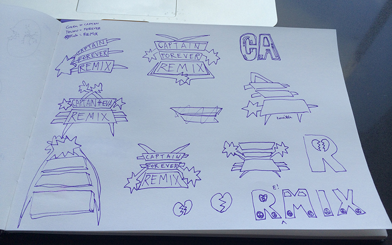
MAKING THE LOGO
The logo went through a million iterations exploring different treatments for color, stroke style, inner detail style, glow, etc. We wanted something that would be iconic, speak to the tone of the game, include visual elements from the original Captain Forever game, and be flexible. For instance we wanted to be able to make stenciled versions of it, or versions with less detail for use on things like our Steam Store imagery where much of the detail would be removed.
The process of zeroing in on the final design involved trying different things and then placing the logo into various different contexts (eg. a website, a twitter image, a header image with a background, etc) to see how well it achieved our goals.

The process began with page after page of very rough sketches to explore different concepts.
Some examples:
SHIP BITS - SPACESHIP LEGO BLOCKS
I designed the visuals for all of the "Ship Bit" modules in the game. There are various types of bulkheads, weapons, thrusters, and more. I felt at the beginning of the project that this aspect of the visuals would take the longest to get right, and that turned out to be true.
There are around 35 different types of modules in the game. They need to look great up close, and the module type needs to be recognizable even when the camera is zoomed out. Color cannot be used to differentiate the different types, as they are procedurally colored, with color denoting the "power level" of a module (ie. every module can be level 1-10, and be colored correspondingly. So a "Scatterblaster" weapon might appear red, or blue, or orange...).

Below is one of the earliest explorations for what modules would look like. The idea was that each level would be denoted not only by color, but by texture. The look of a module would become more technologically advanced as it leveled up. This exercise was useful but I quickly abandoned it upon realizing that this multiplied the amount of visual design work for each module by 10. It would also be work that was done in vain as most of the time an individual module takes up such little real estate on-screen that you can't actually parse its texturing.

Next there were lots of visual tests exploring different styles of stroke and colour treatments (lighter colors for outlines vs. interiors, etc). These tests were done in Adobe Illustrator and tested against background mockups of the game.


Further explorations pushed to see how much silhouette could be used to differentiate each module type. This was the technique we eventually settled on.

I drew from the visual aspects of musical hardware industrial design from the late 80's and early 90's to create the interior details for each module. This was much earlier in the project, when one thought was that the word "remix" in our title might have musical connotations. Even though we moved away from that for the project as a whole, we still kept it in use for the module designs. It just seemed to "work". Below are examples of this in the final designs for the bulkhead modules.


So a ton of iteration happened. The fastest period occurred when Brian Chan spent a week or so working with me at my apartment in Seattle. I iterated on the module designs through round after round of feedback, making smaller and smaller tweaks until we had a style that we were happy with. A large part of this push was to strip more and more detail from the module designs, down to the barest visual elements. This helped make them feel more pure and made it easier to tell each type apart.
If you'd like to see more, I talked about the process of designing the modules in this early Developer Diary video.
DESIGN PROCESS: REMIXING A GAME WITHOUT BREAKING THE MAGIC FORMULA
At the beginning of the project Brian and I had only a rough idea of what features would be present in the game, particularly new features that would be introduced as part of the "remixing" of the original. We did however have a relatively clear set of goals and spent a lot of time discussing our design philosophy and approach to how we'd explore new ideas
Design goals included:
- Minimal changes to the original game's core design. New system additions should be orthogonal to its design.
- The game should "surprise" players from session to session, with a wide variety of emergent outcomes and content to experience and keep the game fresh.
- It should thus appeal to Twitch streamers. Emergent, procedurally-generated situations should be entertaining to narrate and watch.
- The game should spectate well. The audience watching a Twitch streamer play the game should intuitively understand what is happening.
...amongst others. These goals served as a good starting point for us to start exploring new gameplay additions to the original's formula. Our design process was highly iterative, and we threw out many, many ideas that simply didn't work. Much of these ideas are documented in various "Developer Diary" videos that we released.
Before we started to add new features to the original formula, we spent time rebuilding the original game from the ground up in Unity. The first Developer Diary covers this.
Other developer diaries covered further development of the core features (presented by Brian Chan) and in this Gameplay First-Look.
This next video is an early snapshot that shows how a lot of the core aspects of the design went through many changes and tweaks. The concept of "mini-bosses" went through a million iterations and the form it will be shipping in is very different from that seen in this video.
DESIGN COMMUNICATION
With only two developers, most of our design exploration revolved around setting shared goals and identifying problems to solve, and discussing potential solutions. Brian and I rapidly prototyped new ideas so that we could fail fast and iterate quickly.
Design documentation was a must, but was usually kept short in length and utilized as a starting point for a discussion rather than an outline of work to be done. Often documents were used as a recorded history of our ideas, lessons learned from iteration, and a reference for us to return to for systems that need to be revised.
Where possible I kept my documentation visual. Sketches in a notebook or drawing in Photoshop over a shared-screen Skype call are great ways to communicate an idea. Here are some examples of that.


Flowchart for full game flow:

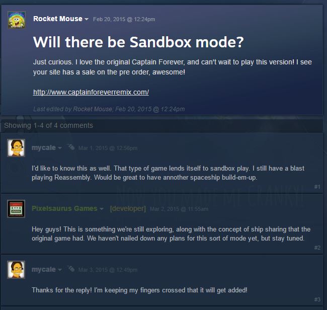
DESIGNING IN FRONT OF A LIVE AUDIENCE WITH STEAM EARLY ACCESS
Iterating on the game throughout its run in Steam Early Access was a unique development experience. Brian and I always had our own thoughts on how to iterate on the game and what to add. Once we entered Early Access, we worked to also take into account what our users were requesting. This helped us prioritize which areas of the game needed the most attention, and get a read on which missing features were highly requested by our customers.
It was a tricky balance between "doing what we need to do to finish the project" vs. "listening to the audience". Adding features such as sandbox were aimed at adding value to the game and encouraging community growth.
The Final Update and our Launch out of Steam Early Access
The game shipped on June 3rd 2016 after a successful stint in Steam Early Access.
To make the final update exciting for users both new and old, Brian and I crammed many new features into the release. These features truly make the game feel like a "remix" of the original, and required far less iteration than any other additions or changes we made to the formula during Early Access. Adding them at a late stage in the project meant we had an excellent understanding of what would and would not work for the game. We made additions very quickly and with a lot of confidence.
Here's is the update announcement on our Steam Store Page.